
Did you know that the ‘father’ of Epidemiology also created Data Visualisation as we know it today. As we move towards our own “AppCentre” being live and the creation of more Apps within ODP that allow new and exciting insights to be possible from our data, I wanted to share with you an event that is often seen as being the catalyst for the need to understand how data can be visualised to answer questions and how intelligence should always be the reason for collecting data.
In the mid-19th century, the Soho district of London had a serious problem with filth due to the large influx of people and a lack of proper sanitary services: the London sewer system had not reached Soho. Many cellars had cesspools of night soil underneath their floorboards. Since the cesspools were overrunning, the London government decided to dump the waste into the River Thames. This action contaminated the water supply, leading to a cholera outbreak.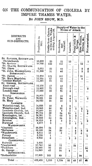
On 31 August 1854, after several other outbreaks had occurred elsewhere in the city, a major outbreak of cholera struck Soho. Over the next three days 127 people on or near Broad Street died. In the next week, three quarters of the residents had fled the area. By 10 September, 500 people had died and the mortality rate was 12.8% in some parts of the city. By the end of the outbreak, 616 people had died.
This outbreak is best known for the physician John Snow’s study of it and his discovery that cholera is spread through contaminated water. John Snow was a sceptic of the then dominant miasma theory that stated that diseases such as cholera or the Black Death were caused by pollution.
By talking to local residents, Snow identified the source of the outbreak as the public water pump on Broad Street. Snow took his evidence in the form of data lists to the London government to ask them to remove the handle from the pump, thus closing it down and disrupting the link to the spread of the disease. The government of the time did not believe Snow’s data and were wedded to the idea that the illness was spread through the air. Snow was convinced he was correct, so he considered how to portray the data differently.
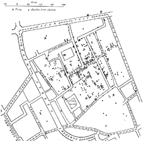 He decided to use a spot map to illustrate how cases of cholera were centred on the pump. He also made a solid use of statistics to illustrate the connection between the quality of the source of water and cholera cases. Snow’s efforts to connect the incidence of cholera with potential geographic sources centred on creating what is now known as a Voronoi diagram. He mapped out the locations of individual water pumps and generated cells which represented all the points on his map which were closest to each pump.
Snow’s study was a major event in the history of public health and health geography and influenced public health and the construction of improved sanitation facilities beginning in the 19th century. This can be regarded as the founding event of the science of epidemiology.
As we move towards the “AppCentre” being live and populated with new ways of looking at data to create insight I thought it would be useful to reflect on the beginnings of Data Visualisation and Business Intelligence and use this famous “case study” to elaborate on how new ways of answering questions can prompt new exciting questions that can evolve how we will work and deliver.
Our Open Data Platform and AppCentre are built on QlikView technology, a solution that enables us to gain insight from the linkage of big data sets and the visualisation of these.